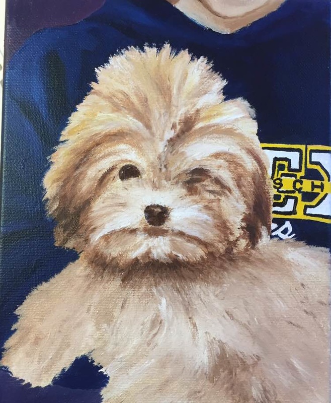
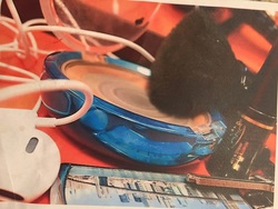
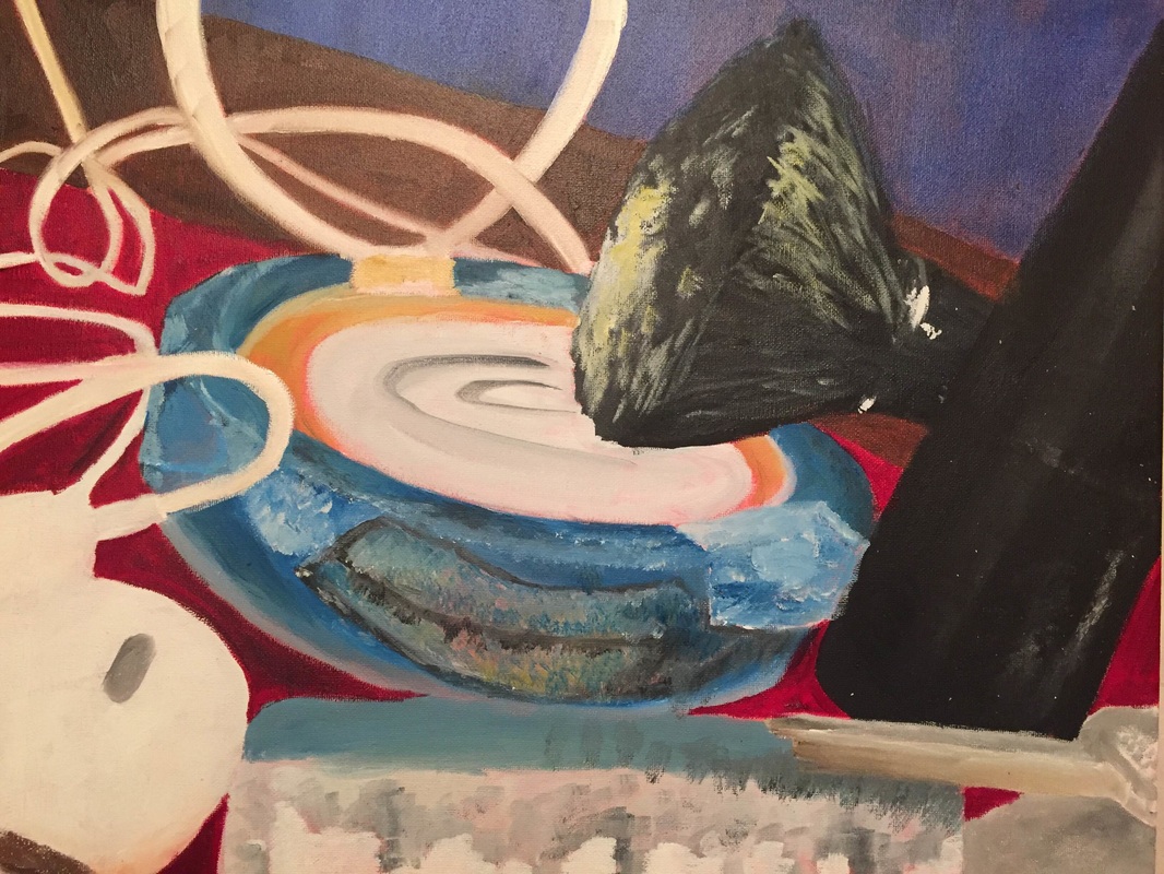
This is my second time doing an actual piece in oil paints. Unfortunately, i painted my dog first before the sweatshirt which made it hard to make the fur actually look like fur against the sweatshirt. I should go in and try to make the eye more distinct. capturing fur is pretty hard to do and creaking depth in it but with the right use of dark and lights it gets easier over time. I did the background purple because i think it complimented the other colors in the piece.
I did my concentration based off the concept of time. I used acrylic paint on paper because originally i was going to use colored pencil, but it was difficult to do the background because it kept drying so quickly. I did the theory of evolution to show the concept of time on the clock with stars in the background so it kind of looks like they're actually walking. I came up with this idea quickly and finished it quickly explaining the lack of detail but i like the idea and would enjoy trying to capture the same idea again which i will most likely do.
This is my third time using colored pencils for a piece. I really like how i captured the colors on the page, i finally got it looking the way i wanted. I used brown colored paper which i think was a good choice. The flowers in both corners aren't how i want them to look mostly because i didn't have enough time. Other than the flowers, i tried to use all the different colors i saw in the photo i was trying to draw, in my piece and really push the highlights.
This is the second time i used the prismacolored pencils. i stared out with the head trying to look robotic but the pipes and different wires and things in the head are supposed to represent how the brain works. I added the clock in the background mostly because i like clocks and the concept of time in our lives and i also needed a background. I think the different colors i used really work together and the angles of the larger pipes add to it.
My self portrait was my favorite piece to do. Originally, i was only going to do pen and ink which i used in the hair and the face, but then decided the purple and green would add to it as well as the blue eye which i used water color pencils for the first time. Learning the different techniques to capture the look i was going for really helped. drawing the hair was my favorite part and most fun and i usded the ink with different amounts of water in it to create depth.
my landscape was done in oil paints, i still need to go in to fix the letters and numbers because they weren't dry yet. It was my first time ever trying to paint mountains or even a landscape. I tried to go in and highlight areas using white against the blue. i don't think it's one of my best pieces but i can go in and fix some things when it dries.
we had to work with our mentees for this project and it was my first time as well as her first time doing a multimedia project. it was confusing to put together mostly because while it's supposed to stay random it's also supposed to look put together. i think we did a good job using our resources and using the red and pink shades of color together.
This was my first time ever using oil paints and i really tried to capture the different colors of the apple with the different highlights and shadows. i used a light layer of acrylic paint as the blue background but used oil for the green.
In this piece i used pastel color pencils for the shoes and regular pastels for the background. i tried to use different stroke patterns in the background for the wall to create some depth. i didnt include the other shoes behind the heels because i didn't have enough time. i enjoyed using the pastels because they're fun to experiment with.
I really liked the angle of this picture, i had to rush towards the end which explains the lack of detail. The use of going light to dark really helped in this piece with the key/key chain. It was difficult capturing the highlights in the dark objects and details in the keychain but i also like the simplicity of how i portrayed it. |
Archives
May 2016
Categories |